Guest Post
How Will You Improve Accessibility of Your WordPress Site?

If you want to sustain yourself in the world of progress, it is important for you to keep upgrading. Well, this also includes the ‘www’. Anyone who has a website needs to think about its accessibility. Whenever you have to design an effective website you need to consider the techniques, skills as well as testing. Designing an effective website requires a lot of techniques, skills, and testing. Testing is for determining the WordPress website’s usability.
However, it is closely associated with the accessibility of the website. Therefore, if you have a website, you need to think about its accessibility. So, how do you define the accessibility of a website? To define the accessibility of your WordPress website, I would say that it is nothing but making your website conveniently viewable to users.
The ability and disability of a person will not determine whether your website is accessible or not. Imagine a blind person being able to easily surf through your website and access the contents. Accessibility, in simple terms, means giving every user an equal opportunity to browse your website regardless of the technological limitations. Let us take a look at how to improve the accessibility of your WordPress site.
- Consistent Layout and Structure You might often fall prey to amazing templates and themes and wish you could use all the themes on your website. However, it is important that your website maintains a consistent layout in order to improve the accessibility of your website. You need to have the sidebar, navigation panel, and headers consistent across all the pages of your website.
- Add Alt Text for Images Alt Text is nothing but an alternative to an image or picture – the same as a small description describing the image. For example, if you have a picture of your pet cat who is jet black, your Alt Text should say “My Black Pet Cat”. Those people who use screen readers because of vision problems will be which are used by people who have vision problems, will use this text to read out what is in the picture. However, unlike the title attribute, the user does not have to include the alt attribute and many WordPress users will just ignore it.
- Use Headings Correctly It is important to use headings for all the WebPages. They give your website semantic structuring. A website normally has a tag to set its main title. However, the more important aspect is to use the headings correctly. Follow the rules given below to ensure your headings are correct. They are:
- Use only 1 H1 on each page.
- The H1 content is nothing but the title of the page.
- Use headings in a sequence of H1 – H6.
- Don’t skip headings going down.
-
HTML5 allows you to use more Headings than H1.
- Make meaningful Link Content many technologies that are assistive usually show links on a separate page. Suppose if you have a page with links like “click here”, “read more” or something like that on a page of assistive technology, it will not be very comprehensive. It might not make your WordPress website easily accessible. Consider this: Although your link text is out of context, it should still be relevant and meaningful. Don’t use “click here” or “read more”. They irritate the visitors. Make sure that you avoid using URLs for link text. Ensure that the link on every page is unique to the page.
- The Three Tier and Progressive Enhancement There is something called a three-tier approach in web designing, which separates content, style, and behavior successfully. These three tiers enhance the progressiveness of the website, ensuring that every user can access the website data without any hassles.
- Test Although you may have followed these tips to make your WordPress website more accessible, it is necessary you test your website through methods. Check if your website can be navigated through the keyboard. Check your website without CSS Check for contrasts Check if your website runs in different browsers. Understand the color-specific instructions and language Check the structure of your website headings
On a Concluding Note…
When you talk of making your Word Press site accessible, it is all about the themes. You will find some of the themes that are better than others. It totally depends on the website owner, as to which theme fits the website’s accessibility.
Jack Sutton works with VITEB – a WordPress development company based in London. His passion for upgrading his knowledge puts him to research topics relevant to his industry. Besides, he also likes to share his findings by writing about them in his free time. Read some of his bestsellers on different guest blogging platforms.
Guest Post
10 Steps to Evaluating and Measuring Your Marketing Strategy

When you are trying to market a product, the product or service is only as good as the potential clientele think it is. You need to get them to buy or use the item or service before you can tell if it really works for them. How can you go about evaluating and measuring your current marketing strategy?
Input vs. Output
Check your financial statements. Are you spending more money than you are making? In a strong marketing campaign, this should not be the case. You want to tweak your plan to make more money than you are putting into the project.
Customer Surveys
When you sell a product, include a survey along with it. Ask the customer to rate different qualities of the product that directly relate to the market. For example, ask them how they heard about the product and if the visual appeal of the item had anything to do with its purchase.
Phone Surveys
Distribute flyers, pamphlets and other coupon offers to people and see if they call back. You’ll know if the marketing works based upon how many people call. When they do call, ask what elements of the flyer or other item made them want to call you.
Test Group
Before you send a new item onto the market, have a test group to evaluate your marketing. For example, you might bring in a section of the company that has never seen the ad. Ask them what they think and if they would buy the product.
Introspective Analysis
What about you? Try to separate yourself from the ad as much as possible. Imagine that you were walking down the street and saw this advertisement. Would you feel inclined to purchase it or use the service? What elements of it are captivating and visually appealing? What elements turn you away?
Quantitative Data
Of course, all of these surveys and questions are important; however, you must generate quantitative data from all of them. For example, calculate the percentage of people who learned about your company from the Internet, paper flyers, word of mouth, and so forth. Put the information into charts.
Compare Years
After you have put the information into charts, you should start comparing this year’s findings to last year’s findings. If you find that a larger percentage of people are using the Internet than last year, you will have gained valuable insight into the company’s advertising.
Targeting the Many…
Once you find where most of your patrons are coming from, work to keep up steady advertisements in that domain. If most people are finding your company through Google searches, maintain fresh SEO strategies throughout the year to keep generating customers in that manner.
…And the Few
Let’s say that very few people are finding you from paper advertisements in the local department store. If this is a new trend, give it another shot to try to keep those few customers that you have. If it’s a continuing trend, you may want to put that money into another avenue.
Keep It Up
Don’t let your evaluation and measuring strategies fall to the wayside. You need to keep using them to ensure constant success for your company.
Evaluation and measurement strategies can bring both good and bad news to you about your marketing strategy. Be sure to use all of the information to generate more positive outcomes.
Thaddeus McGregor writes about business, marketing & finance at
www.businessinsurance.org.
Guest Post
6 Best Online Plagiarism Checkers to Detect Duplicated Content
This post discusses the importance of detecting and removing plagiarized content for credibility, originality, avoiding penalties, and academic competence. It suggests using a plagiarism checker while writing, highlighting six best online plagiarism checkers: Prepostseo.com, EduBirdie’s, Writer.Com’s, Check-plagiarism.com, Plagiarisma.Net, and Bibme.Org. The article also gives a step-by-step guide for detecting and removing plagiarism from content. Some side recommendations include Grammarly, SemRush, and Invideo, among others.
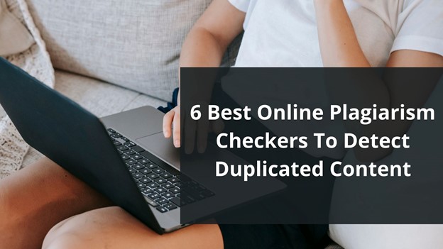
Using a tool is one of the first steps in removing plagiarism. In a time when around 1.5 billion pages on the internet have duplicate content, writers must formulate something original and outstanding.
That’s when a plagiarism detector comes in handy, as they can help the writers by:
- Finding plagiarism’s percentage
- Detecting duplicity by scanning vast databases
- Analyze similarities/compare duplicate content
- Check for originality after removing or rephrasing plagiarized content
These factors make a plagiarism checker necessary in any writer’s arsenal today. However, that’s where the challenge begins: finding a free plagiarism checker. So, to help you find such plagiarism finders.
Defining the Necessity of Detecting & Removing Plagiarized Content
Finding and removing plagiarism is an essential practice that every writer must learn. It’s not only about your credibility; it’s also about the purpose you’re writing for. For instance, if you’re writing in a professional setting, the image of your workplace depends on it.
Suppose you’re writing content in an academic environment. In that case, your grades and future hang on your ability to write original content. Sometimes, plagiarism can be accidental, but that doesn’t make it less harmful.
That’s why it’s crucial for any writer today to use such tools to remove plagiarism. And here are four primary reasons that signify the importance of finding and eliminating plagiarism:
· Promote Original Ideas
Originality is the key in any setting, whether it’s academic or professional. Any plagiarism in the content will make it unoriginal or lackluster. That’s why you must find duplicity and remove it accordingly to promote original ideas and stand out as a good writer.
· Establish Credibility
Credibility as a writer depends greatly on how well you write original content. Therefore, regardless of the purpose of your writing, you need to establish your credibility as a proficient writer by removing plagiarism. This will grant you a vote of confidence in any situation that you write.
· Avoid Google Penalties
As a blog writer or website owner, your job is to stand out in the SERP ranks by creating SEO-friendly content. The fact remains that no SEO-friendly content can ever have plagiarism in it. Therefore, removing plagiarism for better SEO is important for any website or blog.
· Academic Competence
To advance in grades and overall academic venture, you must write content that helps you establish your expertise and competence. Suppose your research papers or essays have copied content in them. In that case, you will be compromising your academic competence, so you must remove plagiarism from it.
6 Best Online Plagiarism Checkers to Detect Duplicated Content
You can find them all on Google, from outstanding plagiarism finders to some that might miss duplicity. Therefore, it’s no surprise people look up to experts to find tools that help them with this necessary factor of content writing.
We’ve picked a list of tried and tested tools to make it easier for you. These tools are both paid and free. So, without further ado, here are the six best online plagiarism checkers to detect duplicated content.
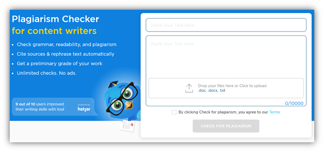
1. Prepostseo.com
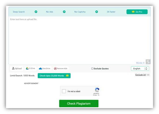
For good reasons, PrePostSEO is one of the common names in such tools. The plagiarism checker by this provider testifies to their position as one of the best toolmakers today. This plagiarism finder finds duplicity effectively and leaves no stone unturned when looking for plagiarism.
In other words, this visually appealing content scanner allows you to scour through the depths of the internet to find duplicity. Therefore, you can depend on it to find any plagiarism in your content and its sources.
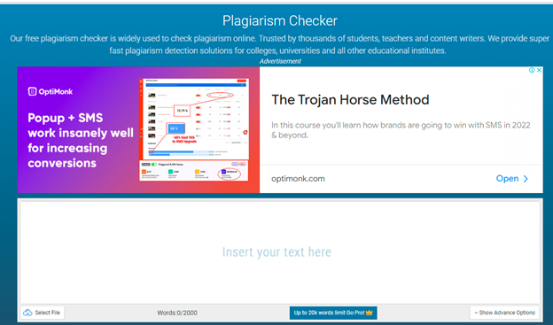
2. EduBirdie’s
EduBirdie’s plagiarism checker is for content writers, students, teachers, etc. You see this line right after you visit the tool, and there’s no doubt about it. The checker doesn’t offer many options except its ability to check up to ten thousand words.
This makes it a checker with some of the most word-checking abilities. Therefore, regardless of your content’s length, you can rest easy knowing you can check any form of content with this plagiarism finder.
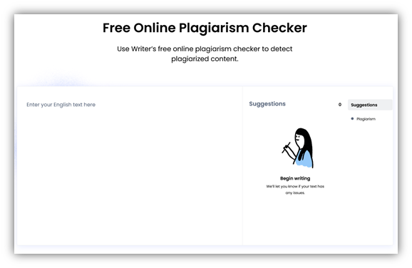
3. Writer.Com’s
You would think a website named “Writer.com” would provide you with a great tool, and they do. The plagiarism checker by writer.com is nothing short of stellar and easy. Dubbed as a “free plagiarism checker,” this one doesn’t ask you a penny.
These factors make it perhaps one of the most lucrative plagiarism finders available today. On top of that, it works quickly, so you won’t have to wait a lot before it scans your content.
4. Check-plagiarism.com
Check-plagiarism.com’s plagiarism checker is perhaps the best tool on this list, not only because of its ability to check plagiarism but also because it can do it in multiple languages. Therefore, regardless of the language you write your content in, you can use it to find duplicity.
The seemingly endless word limit will also put you at ease since you can quickly check any long-form content. However, what impresses us the most is the speed at which this tool operates. In other words, even thousands of words can be scanned with this tool within seconds.
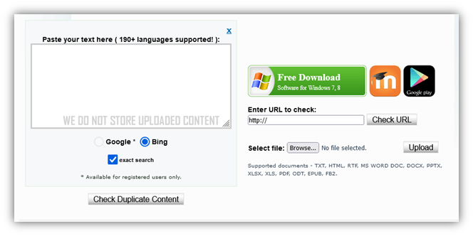
5. Plagiarisma.Net
Plagiarisma.net is one of the tools with the most supported languages. The website itself claims to support over 190 languages. Moreover, this plagiarism finder offers two options in a unique turn of things. These options allow you to check for plagiarism on either Google or Bing.
We’re unsure how effective that is, but it’s a unique approach. Since Google and Bing have very different methods, it could mean finding plagiarism on an extensive level. Regardless, it doesn’t influence the effectiveness of this plagiarism finder.
6. Bibme.Org’s
Bibme.Org steps forth with its easy yet convenient plagiarism finder. Now, this one is targeted toward students and teachers. However, bloggers and other writers can use it all the same—since it employs search engines to find duplicity.
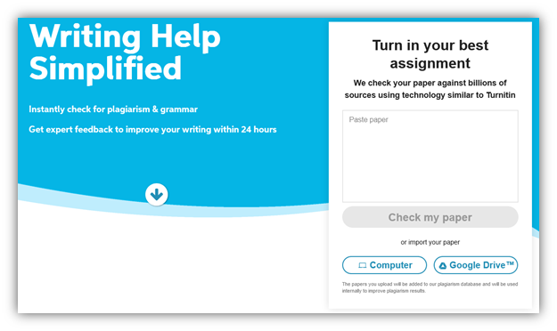
You can also upload your files from your computer or import them directly from Google Drive. But, as the homepage implies, it does use the same algorithms and approach as Turnitin.
How To Detect & Remove Plagiarism
Now that you have the tools to find plagiarism in your content, you must learn how to remove it. Therefore, here is a four-step process for your convenience:
· Use Any of The Tools
So far, the tools we’ve discussed have all their remarkable traits. Therefore, pick the best one that suits your content’s length and scan your writing for plagiarism.
· Analyze Plagiarism’s Percentage
Once the tool has analyzed the content, let it finalize the plagiarism percentage in your content. This will help you understand how much of your content is original and how much you need to rewrite. If your content has less than 10% of plagiarism, then that’s good news.
· Rewrite
Now that you’ve picked apart the duplicate content, you must rewrite it. Remember that you need to rewrite to cite the source—which the tools would help you find.
· Check Again
Now that you have rewritten your content, it’s time that you scan your content for plagiarism again. This will guarantee that your content has no plagiarism or duplicity.
Conclusion
In this post, we looked at six tools that you can use to check for plagiarism in your work. All of them are free, and you can pick whichever one suits your needs.
Before wrapping up, we also looked at some steps that you can follow to detect and remove plagiarism from your content.
Another tool that is not listed and is probably the most widely used is Grammarly.
And some other tools that may interest you. These are affiliate links some I use, some I don’t, so before using, please investigate thoroughly SemRush, Invideo, Squirly Products like Squirly SEO, Gravity Forms, Wpforms, OptinMonster, Buy Website Traffic, AI-powered Marketing, Press Release Distribution Made Easy, Track and Protect your Online Marketing, #1 Press Release Distribution Service, Email lists and Distribution Tech, Placeit Envato, Monster Insights, SmashBallon, Icegram, HubSpot, WPwebHost, ConvertKit, Rytr, Canva, QuillBot, Shortly AI, Market Muse, Content Studio, Social Pilot, Strinkingly, CircleBoom, TailWind, Hotjar, The Hoth, Linkilo, CleanMail, HexoWatch, NetPeak, SerpStat, SiteChecker, SproutSocial, WeVideo, Social Dog, EzMob, Sign Now, Tidio, WP Data Tables, Copymatic, HeyGen, Synthesia, Fliki, ElevenLabs, ADcopy, Beehiiv, EduBirdie.
Guest Post
Top 8 popular WordPress plugins of all the time
The WordPress plugin repository has over 54,000 plugins that enhance user experience by filling gaps in WordPress’s core functionality. Eight prominent plugins include Yoast SEO for optimizing SEO and readability, Akismet for spam filtration, Jetpack for multiple functionalities, WooCommerce for e-commerce, WPForms for form creation, WP Rocket for speeding up page load times, Elementor for complex designs without coding, and Migrate Guru for WordPress migration. They contribute to the website’s security, user-friendliness, and speed.

The WordPress plugin repository has 54,000+ plugins. That’s like a lot. These plugins are used to complement the core WP installation. In other words, it improves a user’s experience on WordPress. They handle certain features and functionalities that WP cannot do by itself.
Choosing the correct plugin is vital for your website’s security, user-friendliness, and speed. Else you can take WordPress support from a good team.
We have listed down the top 8 popular WordPress plugins. Let’s discuss first what WP Plugin is.
WordPress Plugin
WP plugin is defined as a software tool that is scripted in the PHP language. It includes additional features on your WP website. The plugin provides a simple process to add features to your website without writing a single code.
The API of the plugin provides an effective hooks’ and filters set. This robust set enables developers to modify or add new functions with WordPress.
8 Popular WordPress plugins
Search Engine Optimization is necessary to boost traffic to your website. Without any doubt, Yoast SEO is the best WordPress SEO plugin. It supports you to add Meta tags, connect your website with Google Search Console, etc.
The plugins provide you with a complete solution to improve on-page SEO. The features of Yoast SEO are as follows:
- Readability check
- Internal linking suggestion
- Access to create custom Description/Mets Header
- XML News Sitemaps
- Quickly build 301 directs with the Redirect feature
- Optimize for synonyms, keywords
- Update as per Google’s algorithm
The plugin makes sure that your site meets the top-most SEO principle. It provides the tools to optimize your content for overall readability and SEO.
Every day it is not easy to filter out spam that is either irrelevant stories or promotional links. Automattic developed a tool called Akismet.
It is known as the godfather of comment spam reduction plugins. The plugin works great to track back spam and filter out most comments. It reviews all your contact form submissions against their global spam database. This WordPress Premium plugin provides advanced security solutions along with spam protection.
To use the plugin, you will need an API key that is free for non-commercial use. It is beneficial if you receive at least ten comments daily.
The Automattic company built another top-most WordPress plugin called Jetpack. It is a versatile tool with numerous features. The plugin supports you with design, marketing, and security. Among its multiple features, you can perform the following-
- Spam filtration
- Malware scanning
- Find site analytics
- Login security
- CDN
- Automatic social media posting
- Slow image loading
- Multiple WordPress themes and more.
How can we miss WooCommerce among the list of popular WordPress plugins? An e-commerce plugin enables you to sell anything on the web simply.
The plugin has an abundance of themes, easy customization options, and much more. Therefore, it stands unique among the list of WordPress plugins.
Wondering why WooCommerce is best for you? The plugin provides features such as adding product variation, extensive payment methods, etc. The developer community creates extensions to make online selling as smooth as possible.
WPForms
WPForms is a fantastic plugin that allows people to create popular forms with simple and easy steps. The form is created by using a simple interface of drag-and-drop. This plugin enables you to create contact, subscription, payment, survey, and other forms. It doesn’t require you to put in a great effort, as you can create forms with just a few clicks.
Note that this plugin can integrate with all the primary payment and marketing platforms.
Every business requires quick page load times and to accomplish this caching solution is the most effective way. The WordPress repository has a Premium caching plugin called WP Rocket. It helps to escalate the loading time of a site. The plugin works with the cached copies and reduces the servers’ workload. It also aids in lowering the HTML, JavaScript, and CSS file weight through minimization. The features of the plugin include-
- Compatible with cloud flare
- Improve user-end browser caching
- Quick Load images while scrolling down
- Support WordPress Multi website
- Incorporate caching solution along with a CDN
- Load images on request
- Facilitate slow loading to boost page load time.
Page builder aids you in creating more complex designs as you don’t need to use coding. The most popular page builder plugin as per WordPress.org is Elementor. The plugin has quickly shot up the rank with over 1.2 million active installs. It offers a free package to build complex designs with a drag-and-drop interface.
You must think of installing this plugin on your website. This will support you to have full control over your design.
Migrate Guru is a specifically designed, fully automated plugin for WP migration. It offers you the fastest, easiest, and most reliable method to migrate your WordPress website. The plugin runs on an external server named BlogVault’s server. You can quickly transfer large sites without any issues.
There is a choice to save the migration setting and remove the unnecessary files during the migration process. This allows you to repeat the migration with a single click in the future.
The plugin has the following feature:
- No overload on the website
- No requirement for storage space
- Easy to use
- Build for large websites
- One-click migration
- Fully automatic, replace & built-in-search
Large images slow down the loading of websites. Therefore, it is crucial to optimize every file image to improve speed. Optimizing every image manually can be a tedious task.
For this, you can apply the Smush plugin. It is a simple way to compress and optimize your WP website images. The plugin compresses images all over your website automatically. You will need to upload images to your WP website media folder.
The plugin provides no interruption in your workflow and improves website performance.
Conclusion
A WordPress plugin helps you to quickly and smoothly run your website. It improves user experience and supports websites to reach a wider audience.
No need to get confused about which plugin is best for your website. We have mentioned 8 of the pre-eminent WP plugins of all time. These plugins are accessible in free as well as paid forms.
Author’s Bio
Jinny Sarah Jacob is a Sr. Technical content writer at 24×7 WP Support, a leading WordPress development company that supports WordPress themes, plugins, and errors. She is a passionate technology geek and loves to write blogs on marketing, technology, B2B, big data/analytics, business strategizing, etc.
-
Tips & Tricks4 months ago
WordPress Security Hacks
-

 Pages6 months ago
Write For Us – Guest Post
-
Showcase1 month ago
StylizedWeb.com
-
News6 months ago
How to: Show/Hide any div box with jQuery in WordPress
-

 Plugins2 months ago
Top Membership plugins
-
Tips & Tricks5 months ago
Remove the title attribute using jQuery
-
Guest Post2 months ago
The Top 10 Best Free Android Retro Games of all time
-
Tips & Tricks2 months ago
How to: show/hide a widget in WordPress with jQuery



You must be logged in to post a comment Login